

It’s a fact, I have a hard time parting with meaningful things. When it came down to cleaning out the house where my Oma lived so she could move to a senior community, it took a lot of self control to not fill our 600 square foot apartment with all of her belongings.
One thing I did allow myself to take was her collection of vintage handkerchiefs (and quite a few other things, don’t worry!) I’ve had them folded up in a pretty brass bowl, and every once in a while I like to take a gander through them. In my recent perusing, a collection of earthy plaids jumped out at me among the frills, lace and pretty pink flowers. Perhaps the cooler weather and the changing seasons has something to do with finally noticing those in the mix. It got me thinking: how fun could these patterns be when layered over one another in a cozy cabin in the woods? While I don’t have that cozy cabin of my dreams at the moment, there’s no harm in planning for it one day, right?
So let’s talk about how we can get from point A - handkerchiefs, to point B - a room design inspiration board.

STEP 1 -
Define the colors. There are no set rules here, but I find it easiest to pick out a palette that includes about four or five colors - pulling from your inspiration source. Use these colors as a guide when sourcing your furniture and textiles.
STEP 2 -
Come up with a general theme. Do you want a room full of paisley or floral patterns? Maybe you’re into bold geometric schemes? Try to stay focused on a general concept. In this case, using our inspiration handkerchiefs, our obvious theme was PLAID. Taking cues from our inspiration image, having different sizes and styles/patterns of plaid is what keeps things interesting but still cohesive. Some patterns are more intricate, some are simple, some are larger scale. When you are designing a room, having a mix is ideal. Just make sure there is a common theme throughout all of your patterns. You can always reference your color guide to keep you in check.

STEP 3 -
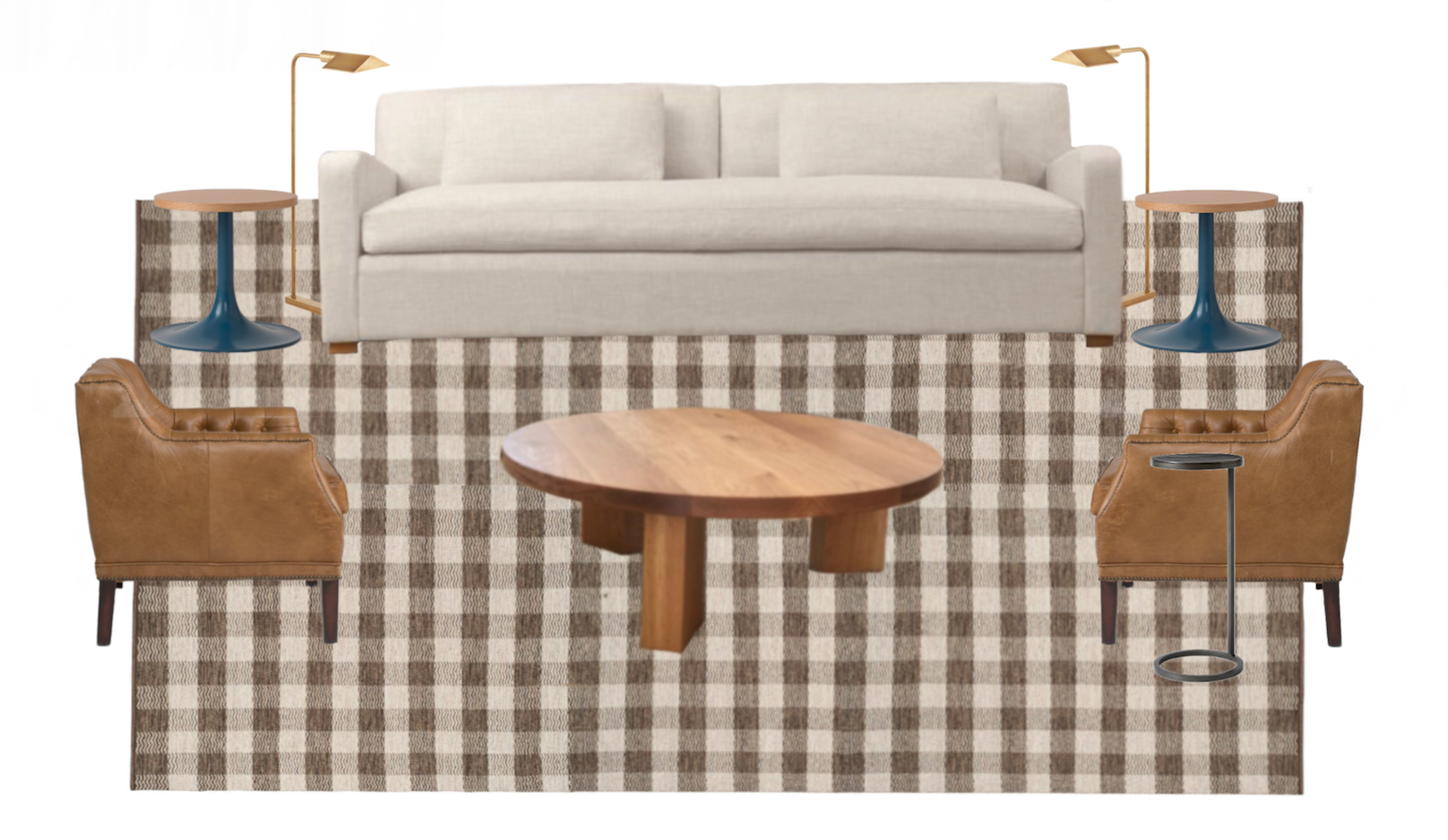
Pick out your rug. I find it easiest to work from the ground up. I always consider the rug one of most important design elements of the space. Once you have this selected, it’s easier to layer in other colors and patterns that coordinate. For this space, I went with a neutral gingham-like rug that undoubtedly draws from our inspiration scheme and offers a cabin-like feel.
STEP 4 -
Add in furniture. In my opinion you can’t go wrong with a neutral sofa. This gives the room an opportunity to feel a little more toned down and allows the patterned rug and accessories to really shine. I’ve also added in leather chairs with tufting and a wood coffee table for texture and warmth. For a bit of nostalgia, I added in some vintage-inspired end tables with a pop of color. While the furniture doesn’t necessarily have any “pattern”, the pieces still stick to our defined color palette. Lastly, mixed metal accents like floor lamps and a drink table add interest and function to the space.

STEP 5 -
Layer in pillows and other textiles. Here’s where I take the opportunity to further develop our general pattern and color scheme. The pillow patterns tie in with the general concept, they are unique enough so they don’t compete with each other, and larger in scale so they don’t fight with the rug. And of course, a soft textured throw that ties in is a necessity!
STEP 6 -
Pull it all together by finishing the room with art and accessories. Use the color palette as a guide but have fun with it. Add in a large statement piece or group smaller items together for a collected look. Here I chose several pieces that fit into the general “cabin” theme while also complimenting the colors in the room. And finally, don’t forget to style the space with candles for that extra cozy factor and a plant to help bring the feeling of the outdoors inside.
So there you have it, a cabin living room design inspired by Oma’s handkerchiefs. I think she’d love to hang out there with me!

Sources:
Rug from Rugs Direct // Sofa from Restoration Hardware // Coffee Table from Etsy // Lounge Chairs from Schoolhouse Electric // End Tables from Schoolhouse Electric // Floor Lamps from Circa Lighting // Accent Table from Pottery Barn // Throw from Rejuvenation // Art (lower left) from Etsy // Art (upper left) from Etsy // Art (center) from Etsy // Art (right) from Etsy // Pillows (blue plaid) from Etsy // Pillow (sand plaid) from Etsy //


