Our house!

Given that we’re spending most of our time at home these days, it feels like the perfect opportunity to finally share our house project with you. I’ll start with the beginning and over the next days, months, and dare I say years, I’ll be sure to fill you in on all of the juicy details as we keep chipping away at this renovation. Full disclosure, things are going to look a lot worse before they get better, but that’s the reality of a renovation!

We lived in our last apartment for 9 YEARS! We loved it, but it was time to move on, to stop renting and invest in something of our own. Ultimately, we wanted to get our hands on a project. As an interior designer that is married to an architectural designer, the last thing we wanted was a home or condo that had already been renovated. Full creative control was a must, but also something that we could manage renovating on our own…while living there. We both wanted an older house, something that we could modernize while preserving the charm and historic features. After what felt like endless searching we came across a cute little gambrel style house in a charming neighborhood that needed a LOT of love, and well, here we are.

IMG_6781.jpg

The house is tiny, a little over 1,000 sq ft, and honestly, I can’t imagine having to renovate more house than this right now. Kyle is doing all of the work himself and thankfully we’ve had help from friends when we’ve really needed it. We’ll sub out the HVAC, plumbing and electrical, but other than that Kyle is a weekend warrior, working full time at his job and renovating on Saturday and Sunday when we’re actually home, hence why this may take a few years.

Here’s the original layout for some perspective. Funky at best, but thankfully we’re making some much needed changes as we renovate.

Screen Shot 2020-03-25 at 5.27.45 PM.png
Screen Shot 2020-03-25 at 5.28.01 PM.png

The house was built in the late 1800’s. A lot of the charm was stripped away by some really bad updates over the years, but we’ll salvage what we can (the doors, the staircase). The bones are good, but other than that, the house was very rough. I’m talking 30+ years of chain smoking inside rough. But it’s what we signed up for!

Here are some totally unfiltered shots of day 1.

Living Room

Living Room

Dining Room

Dining Room

Kitchen

Kitchen

Kitchen

Kitchen

Kitchen (check out those uneven floors!)

Kitchen (check out those uneven floors!)

Bedroom

Bedroom

Bedroom

Bedroom

IMG_6798.jpg
IMG_6784.jpg

Next up I’ll start getting into some of the major changes we’re making and our plans to get this thing in decent shape. And don’t worry, I'll be sure to include what it’s like to actually live here while the house gets completely ripped apart. It sure has been interesting…

Ethan's Nursery Reveal

Woodland Themed Nursery

You may remember we debuted Baby C’s nursery design back in March. Well time flies because Ethan is here, the absolute cutest, and just about 6 months old! In March we talked about the goals for the space, as Ethan’s mom Jaime put it, “from the beginning, I envisioned the nursery to be mostly neutral with pops of color - serene, not too "baby" and with pieces that will grow with the baby and our home.”

Here’s where we started, it was a total blank slate…

nursery+before.jpeg
nursery+before (1).jpeg

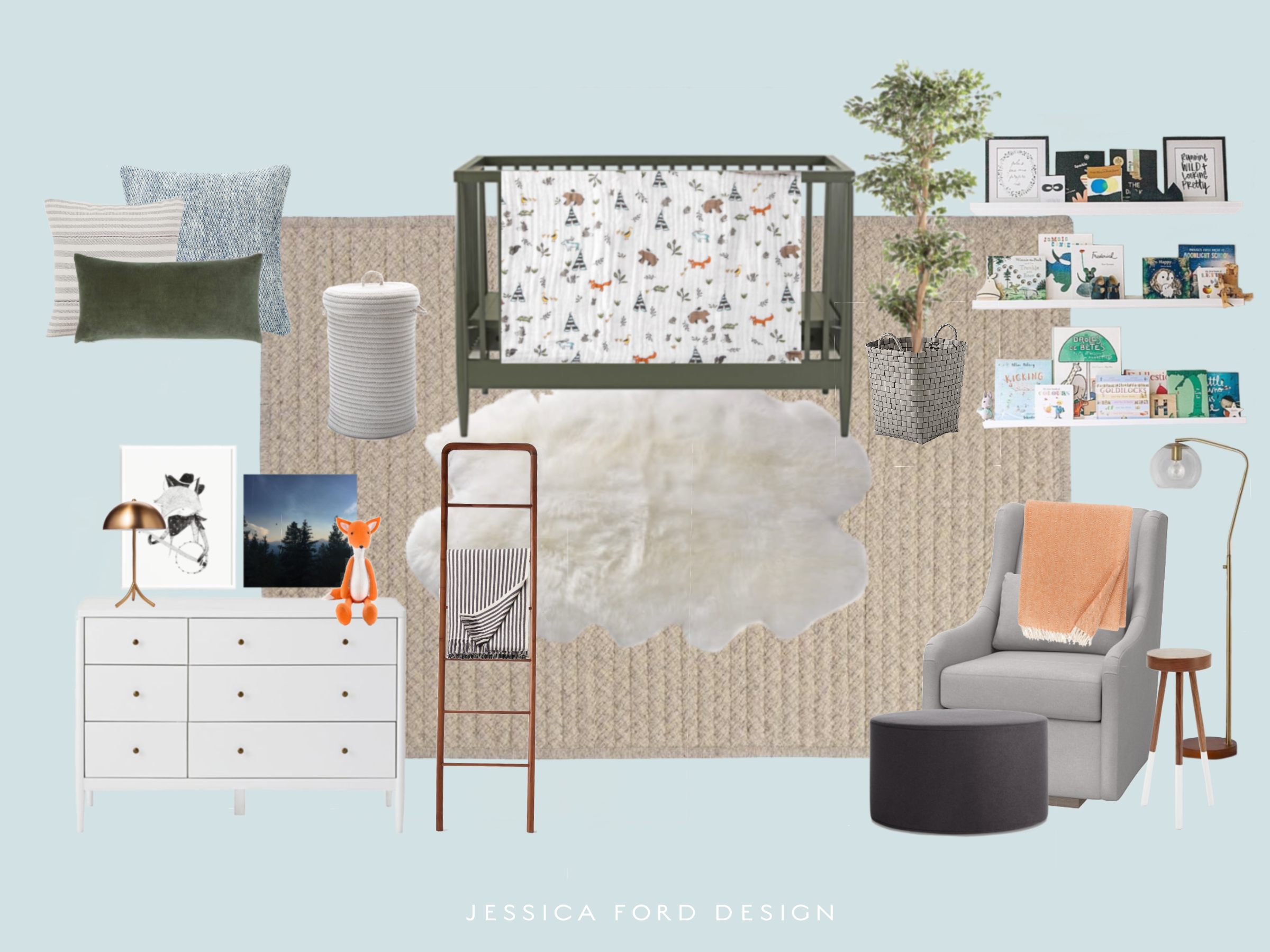
The initial design plan was inspired by the sweetest woodland themed bedding from Little Unicorn. The neutral background with pops of color set the tone for the design scheme.

woodland nursery design scheme

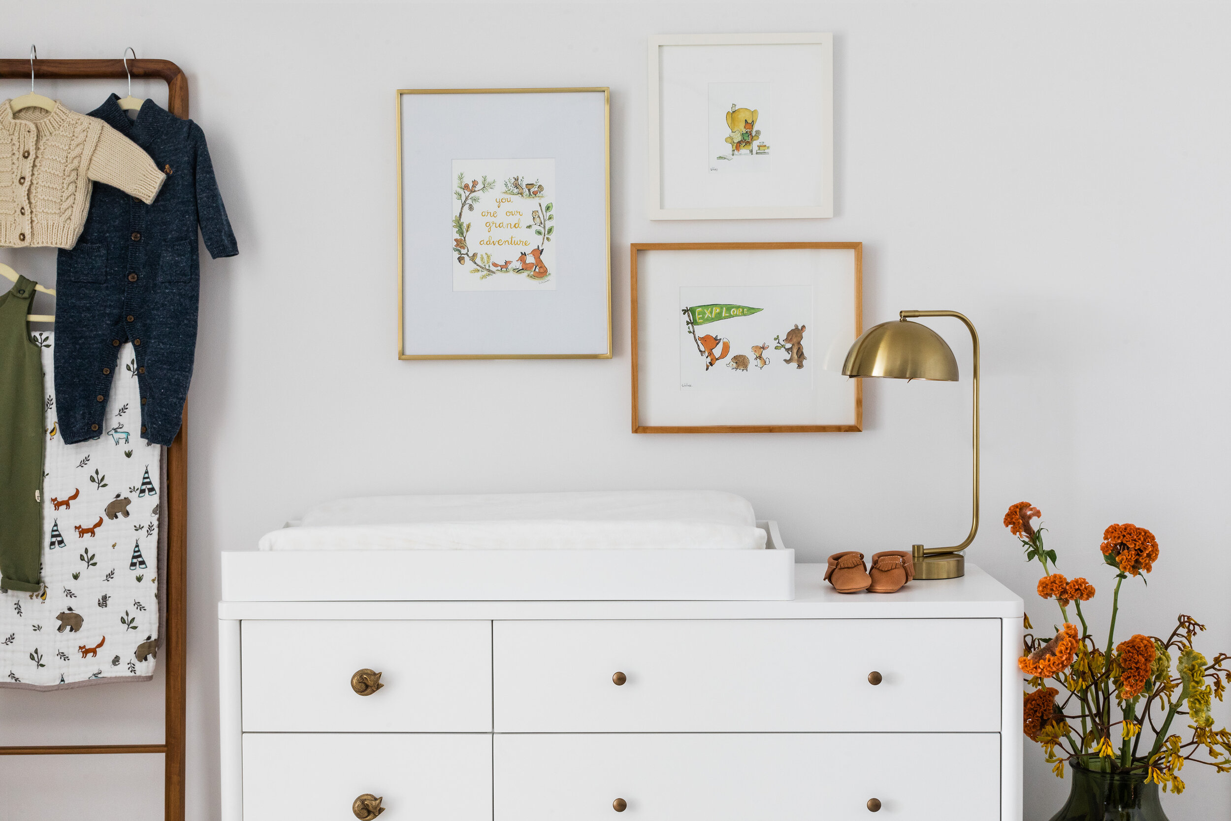
After some iterations to the initial design, we chose to keep the room fresh by painting the walls a crisp white and adding blackout roman shades to coordinate. The dark green crib and a large charcoal ottoman add contrast and some strength to the space, while the creamy warm tones in the area rug, sheepskin and glider add softness and texture. We also decided on a versatile white dresser that can easily adapt to changes in the room throughout the years and to keep the space feeling open. The room has a long narrow alcove that was a bit of a tricky area! We chose to turn it into a little reading nook with a cozy upholstered bench and some shelves that add interest and color to the long white walls, while showcasing Ethan’s books and adorable accessories. And lastly, we added fun punchy pops of color throughout the space to keep things exciting.

I adore this space, a fun but neutral and cozy nursery that can grow with Ethan throughout the years.

woodland themed nursery
nursery reading nook
woodland themed nursery

I think he likes it too!

baby ethan

Interior Design and Styling by Jessica Ford Design
Floral Styling by Wild Folk
Photography by Joyelle West

belmont master bedroom reveal

serene mid-century master bedroom design

I’m excited to introduce you to our finished Belmont master bedroom project. I never got around to sharing the before photos and design plan with you when we started the project, so I’ll give you the full scoop today. Our client moved into this home with a couple of existing pieces they were hoping to re-use - their bed and dresser. Although this furniture was very strong and heavy, the goal for the room was to create a space that evoked a soft, serene feeling, a little “oasis” if you will.

Here’s what we started with before they moved in…

Bedroom Before
genMid.72070965_17_1.jpg

Not a bad start, but the room had some layout challenges which led to the french doors being removed and the closets being relocated beyond that point. This allowed us to free up some space for the dresser. The window was also removed above the bed. While I’m a big fan of windows and natural light, it just felt odd and in the way.

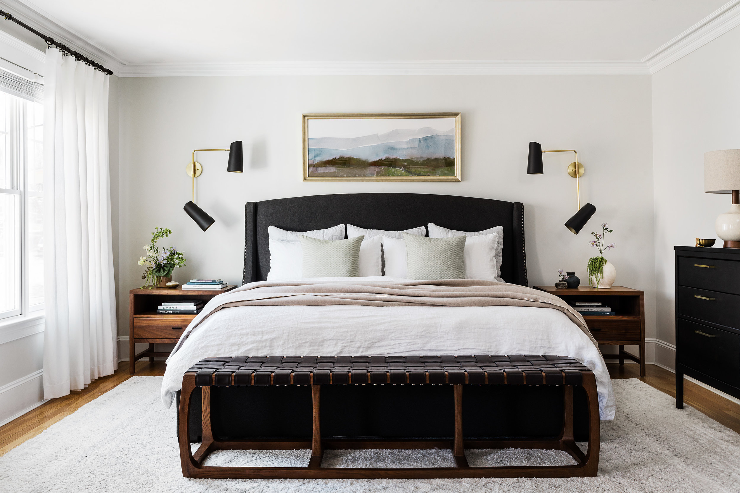
We started out by coming up with a design scheme that balanced their existing furniture pieces while adding warmth, texture and interest. The walnut nightstands and bed bench paired with leather offered an organic and natural feel while still feeling heavy enough that the bed and dresser did not feel out of place. We chose a super neutral and plush rug, sheer curtains and textured linen bedding to add softness to the space. And to accent the room, we added a statement to the dresser with some funky mid-century lamps paired with linen shades, and my favorite sconces with bold black shades and warm brass accents to anchor the bed and nightstands. The large mirror above the dresser adds another hint of brass and reflects the light from the windows to give the room a more balanced feel. Lastly, the subtle soothing artwork above the bed adds to the feeling of softness and serenity.

bedroom decor

The end result came out beautifully, a calm but lively bedroom retreat with carefully thought out details and a fun mid-century twist.

mid-century master bedroom
neutral master bedroom

Interior Design and Styling by Jessica Ford Design
Floral Styling by Wild Folk
Photography by Joyelle West
Renovation by Na Fianna Construction

baby c's nursery project

Hi folks! I’m excited to hop back on here to introduce a fun new project that’s in the works. My dear cousin and friend, Jaime, is due with her first baby boy this spring and when she asked me to help design the nursery I jumped at the chance. As many of you know, interior design projects can mean a whole lot of lead times and patience, so as we count the days until everything starts coming in, I thought I would share our plans for this adorable space with you.

Jaime’s goals for the nursery are summed up perfectly in her blog post, “From the beginning, I envisioned the nursery to be mostly neutral with pops of color - serene, not too "baby" and with pieces that will grow with the baby and our home. Once we found out it was a boy, I was full into a woodland theme. After searching and finding tons of options, we went with Little Unicorn's Forest Friends pattern as the base of the design. It fit the bill perfectly!”. Here’s a little peak at how the room looked before we got started.

nursery before
nursery before

As you can see, the room was a blank slate, my favorite kind of space ;). Once we worked through an ideal layout and a priority list (and got rid of that ceiling fan!), I came up with a couple nursery design schemes to pull it all together. Each scheme stemmed off of a specific crib selection, whether it be Crate and Kid’s Hampshire Crib or Kalon Studios Caravan Crib.

Nursery design scheme 1
Nursery Design scheme 2

We had a little trouble deciding which direction to go because they are both just so darn cute, but finally nailed down some selections and we are on our way! We’ve made a few tweaks since these initial ideas, and I can’t wait to show you the finished project soon! The bottom line is that designing a nursery is FUN. Who’s having a baby next? ;)

monday mood board // the colors and textures of SMA

We’re in the midst of planning an exciting trip this summer and it has me thinking back to some of our more recent ventures. This past spring we were extremely fortunate to visit San Miguel de Allende (SMA) in Mexico and stay at the breathtaking home of designers Jorge Almada and Anne-Marie Midy, owners of Casamidy. I could go on and on about the work of Jorge and Anne-Marie, and I will on this blog soon, but for today’s Monday Mood Board, I thought I would highlight some of the colors and textures of SMA. For all of you fellow design-minded and creative folks, this place is a haven for local artisans, inspiring and historical architecture and amazing food. I can’t wait to share more of this trip with you! Stay tuned…

san miguel de allende